Snoosend: How a map-based redesign boosted conversion
Snoosend is a service that lets you quickly and easily send items from one place in the city to another. You simply place an order in the app, and a courier picks up the package and delivers it anywhere within Qatar.
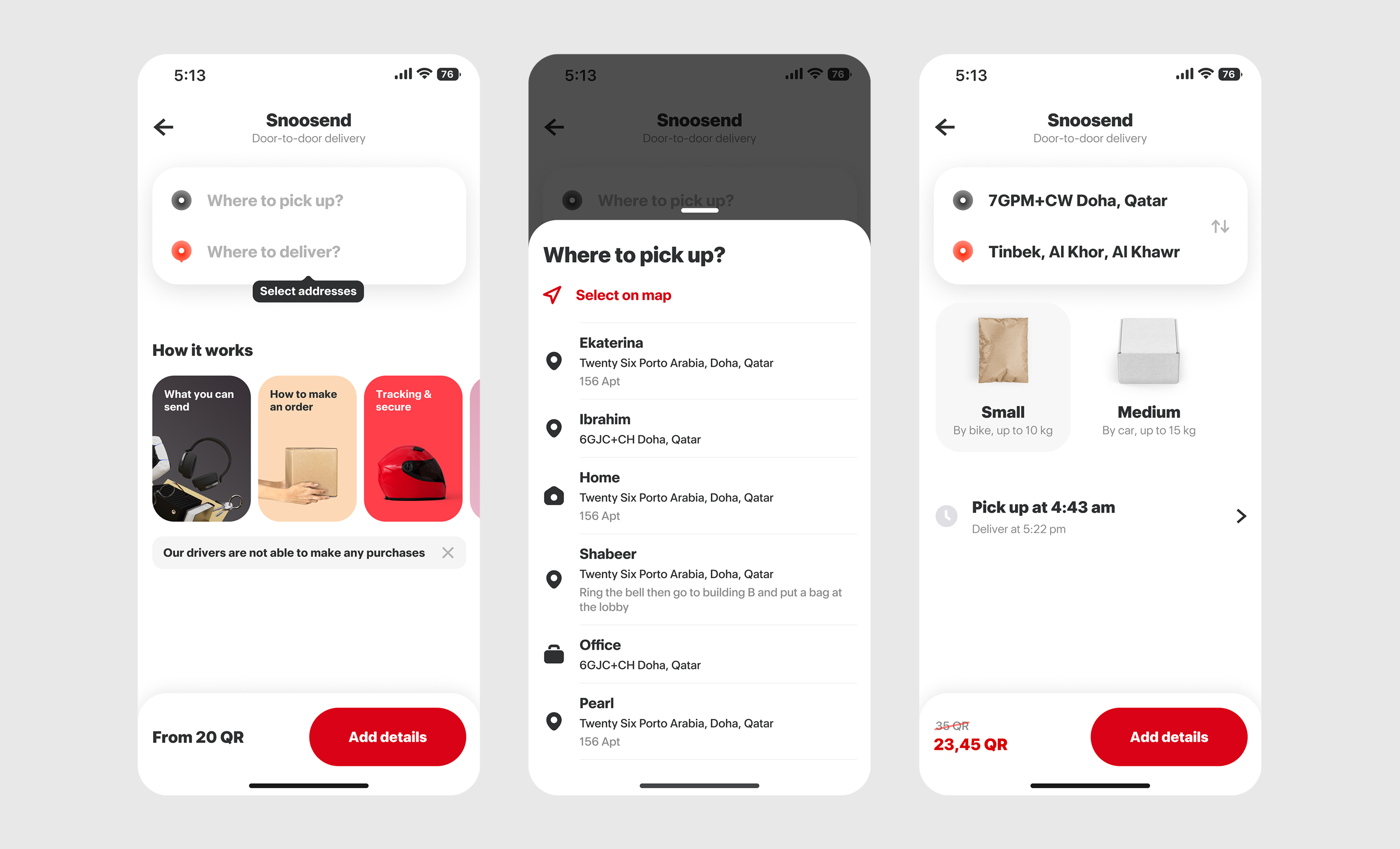
Old version
Problem
After launching the MVP, Snoosend saw steady organic growth. But about a year in, it became clear that a large portion of users were not completing their orders. The conversion rate at the checkout stage was below expectations, which meant that most users were dropping off before finishing. This high drop-off rate at such a critical step was limiting both GMV growth and the total number of successful orders.
Goals
As part of the product relaunch, we set the following goals:
- Achieve steady monthly growth in both orders and GMV
- Keep the cancellation rate within acceptable limits
- Ensure a positive unit economics
- Identify and deliver improvements to the product and overall user experience
Discovery & Implementation
Our analysis showed that users struggled with the address input process. The flow was confusing and required too many steps. Multiple modal windows made the experience distracting and harder to complete. The address selection was neither visual nor intuitive. All of this led to frustration and caused many users to drop off before completing the flow.
- The pickup and drop-off address selection was redesigned and combined into a single screen with an interactive map. Users can now set a location manually or choose from saved addresses, all without additional screens or modal windows.
- A new step was added for pickup time selection, letting users choose when the courier should arrive.
- Delivery type, time, and price are now shown together in one place, so users can instantly understand their options and total cost.
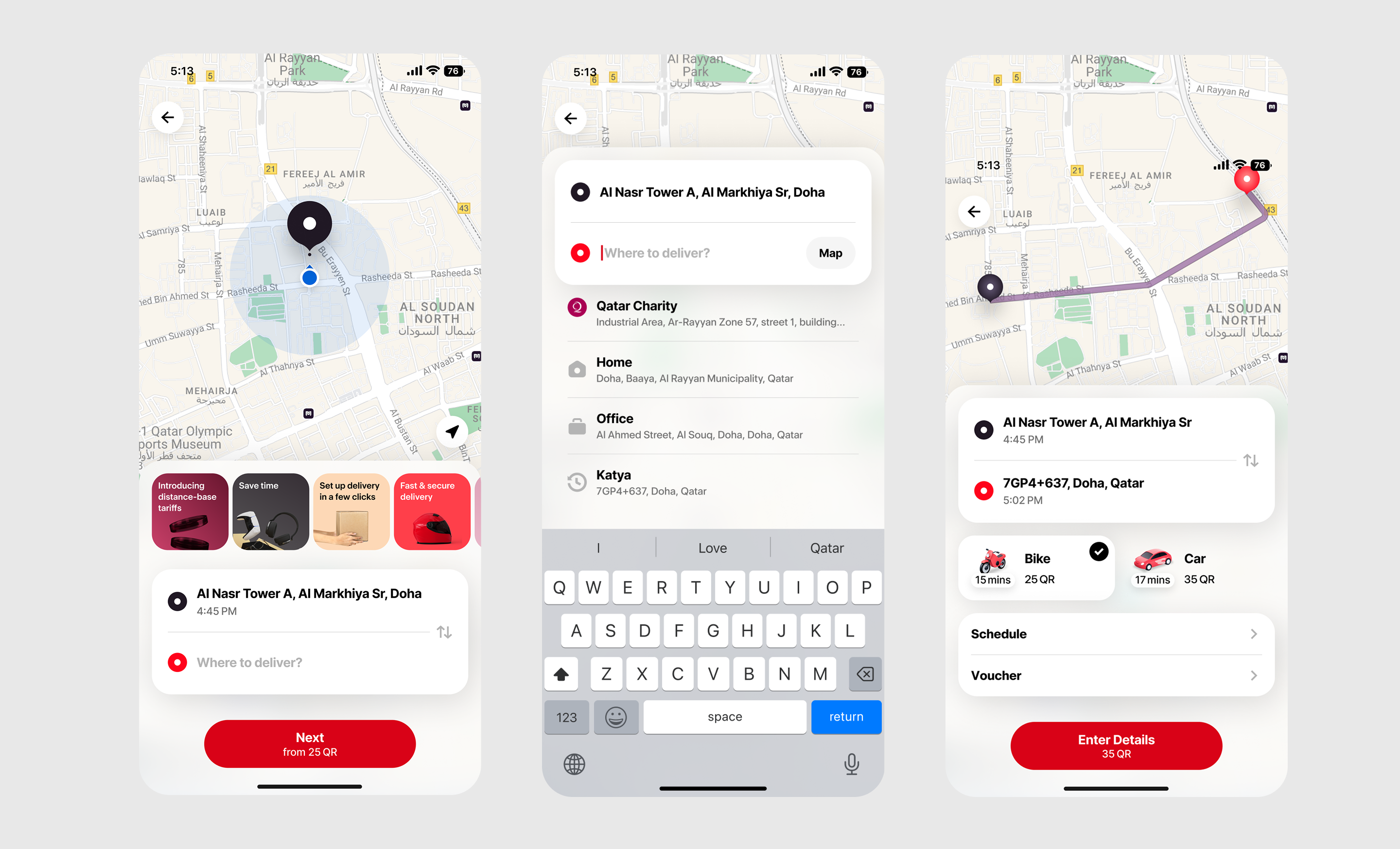
Redesigned home screen
Visual changes
One of the most impactful updates was the visualization of the delivery route. As soon as the addresses are entered, users see the actual route on the map. This solved several issues:
- Reduced anxiety and address entry errors
- Made pricing feel clearer and more logical, since the distance is visible
- Increased trust and gave users a greater sense of control
Beyond UI/UX
- We optimized ETA, which boosted both conversion and user trust
- We integrated StatSig to make testing faster and more reliable
- We refactored event tracking to improve data accuracy
All changes were A/B tested using StatSig, and only the solutions that showed measurable improvement were rolled out to all users
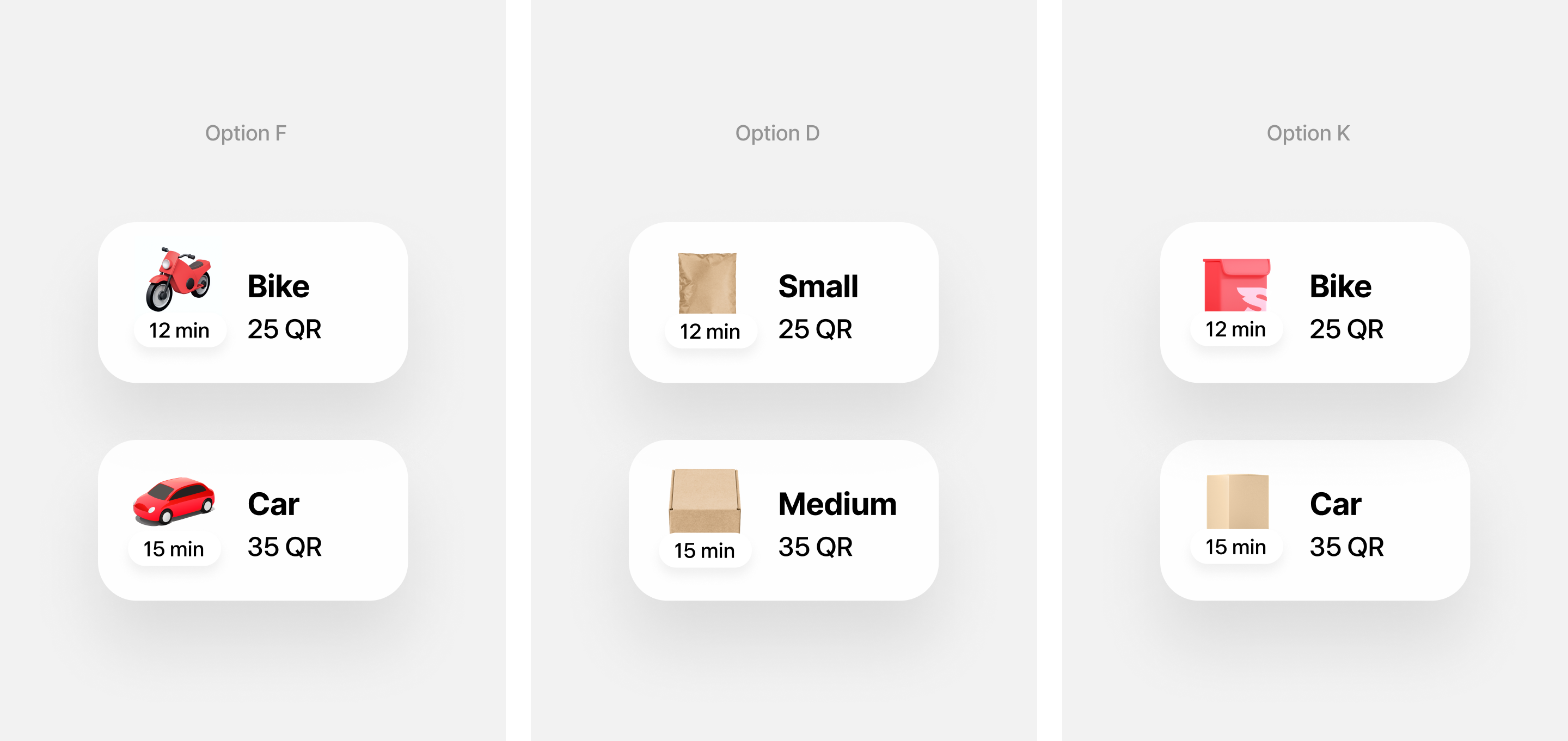
Additional UX research
We ran a focused study on how to present delivery options, specifically looking at naming and visual cues.
We tested three ways of showing delivery types:
- By transport type, using Bike and Car with matching icons
- By package size, using Small and Medium with package illustrations
- A mixed option, combining Bike and Car with package illustrations
We used a mix of UX tests, quick user interviews, and internal testing with loyal users. The results showed that the Bike and Car version clearly outperformed the alternative. It was easier for users to scan and understand at a glance, felt more intuitive, especially in urgent situations, and made it quicker to connect each option with differences in price and delivery speed.
We tested how users interpret delivery pricing by asking them to choose an option and explain what each tier meant
UI
Snoosend: How a map-based redesign boosted conversion
Snoosend is a service that lets you quickly and easily send items from one place in the city to another. You simply place an order in the app, and a courier picks up the package and delivers it anywhere within Qatar.
Old version
Redesigned home screen
We tested how users interpret delivery pricing by asking them to choose an option and explain what each tier meant
UI