Goals
Users clearly wanted to compare products, mix items from different merchants, and explore the catalog without friction. To support this, we focused on:
- Enabling search and browsing across all products, not just within a single store
- Allowing users to add items from different sellers to the same cart
- Displaying all available products in one place, so users don’t need to jump between pages
- Laying the foundation for a more flexible and scalable product catalog
- Separating the food flow from the marketplace in a way that feels clear and natural to users
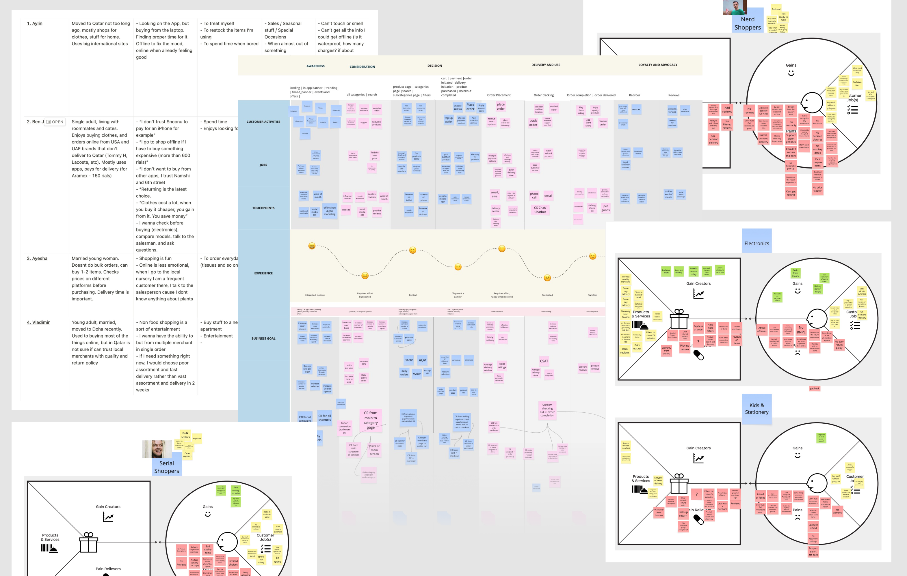
We conducted different types of product research, including user interviews, a CJM, and a pain and gain analysis
Implementation
Over the course of a year, we gradually rolled out the new experience, working closely with cross-functional teams to implement backend updates, introduce new logic, and redesign the UI.
Preparation
We began by mapping out concepts and flows to help backend teams understand the new structure. Once the architecture was aligned, backend teams began implementation, while product and design planned and scoped the next phases.
First marketplace concepts
Multicart
Success metric: reduce cart destroy rate.
When we began sketching early concepts, we quickly realized we were blocked by the existing cart logic – it only supported one merchant at a time. Launching the item-based catalog without addressing this would have led users to add products from different merchants, causing the cart to reset each time. This would not only frustrate them but also damage trust and hurt conversion.
The key question became: should we create a new cart specifically for marketplace items or adapt the existing cart to support both food and non-food flows? Or maybe, migrate food into a new, unified cart altogether?
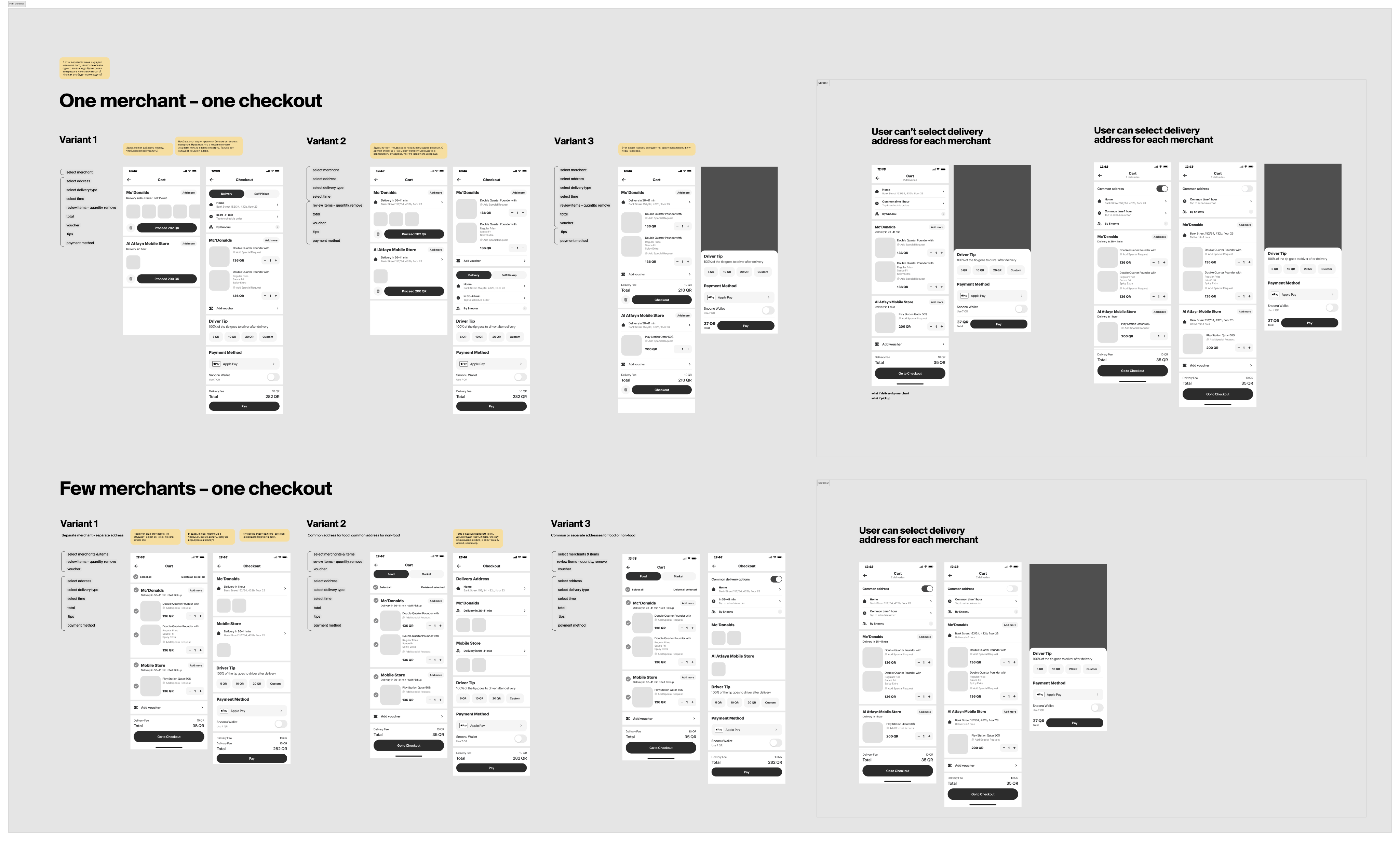
Different approaches for marketplace cart
We explored many directions and eventually concluded that, for business needs and development constraints, the best option was to introduce a new marketplace multi-merchant cart, separate from the food one. This new cart would support multiple merchants and only handle marketplace items.
The next challenge was how to show two carts in the same app without confusing the user. We went with a slider-based solution, where the active cart changes based on the user’s current flow. For example:
- In marketplace categories and search results, the marketplace cart appears first
- In food categories, the food cart is shown first
- Users can always swipe or switch to the other cart if needed
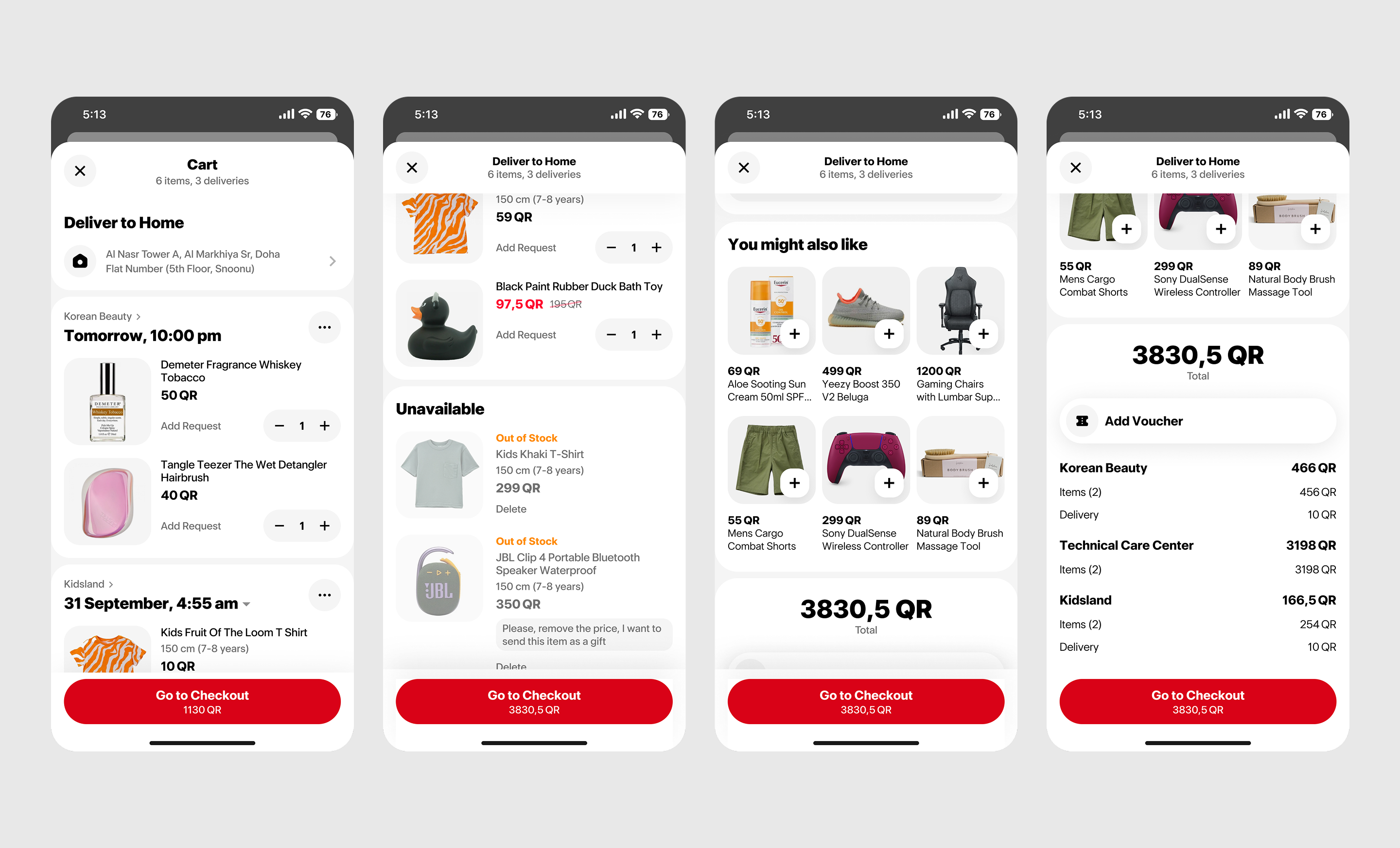
Multi-merchant marketplace cart
Catalog & Filters
Success metrics: Items per order, conversion from marketplace categories to cart
We reviewed all Snoonu categories and restructured those related to the marketplace. Through card sorting and user interviews, we designed a more intuitive hierarchy of categories and subcategories.
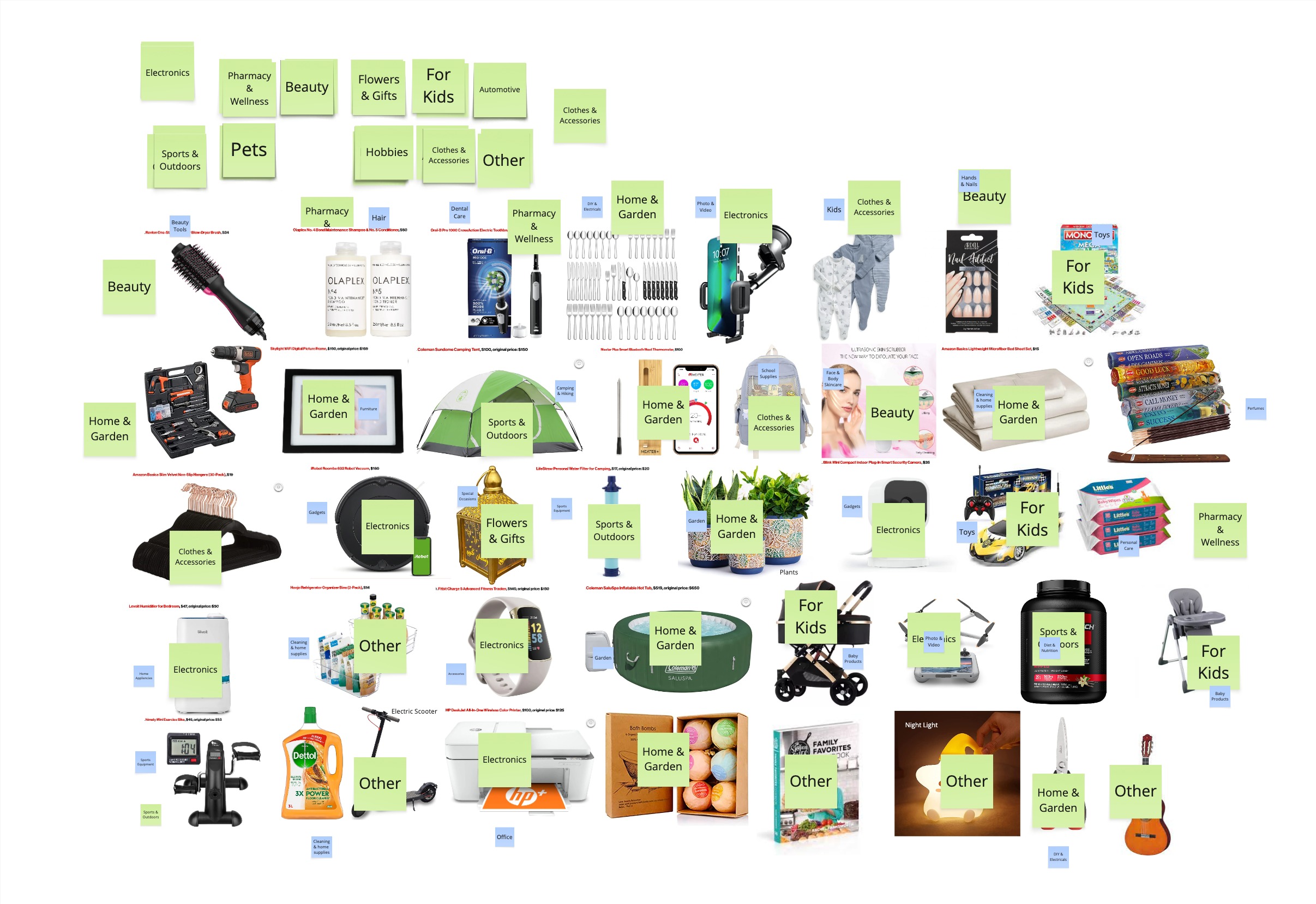
We conducted card sorting to design a more intuitive category structure
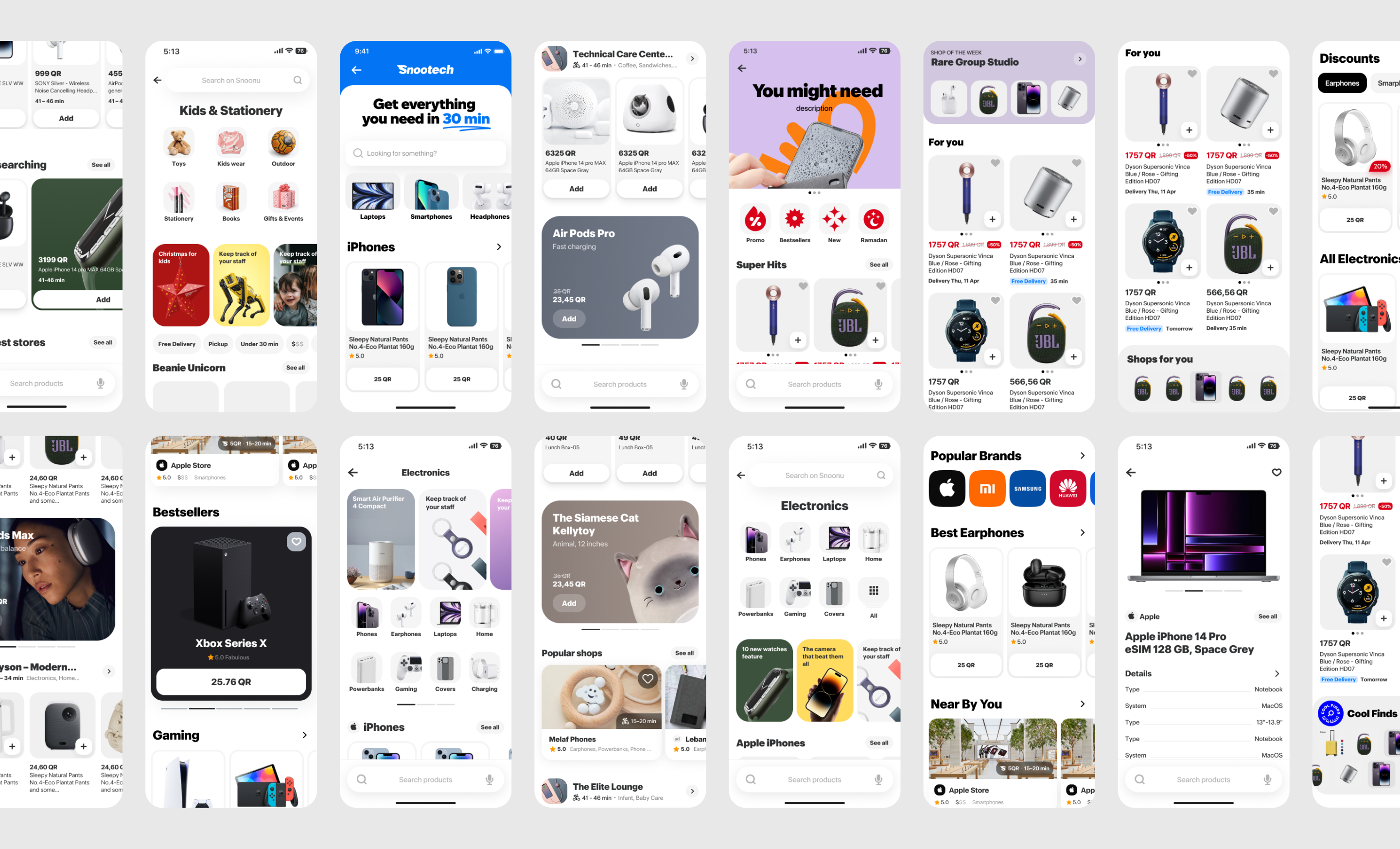
Once we finalized the categories and subcategories, and the backend architecture was ready, we moved on to the item-based feed within those categories. Now, if a user selected a food category, they would see merchants (as before). But if they selected a marketplace category, they’d see item listings instead.
When users added products from marketplace categories, they would go into the new multi-merchant cart. At first, we were concerned this dual logic might confuse users, so we explored tagging the categories as “marketplace” to make it clearer. But after a few rounds of testing, we learned that the use cases rarely overlapped – it’s not common for people to shop for burgers and smartphones at the same time.
Within each category, we introduced its own set of subcategories and filters. The item-based structure finally unlocked the ability to filter by price, brand, and other useful attributes.
We saw an increase in conversion and average items per order, as users could now explore products from multiple merchants in one go.
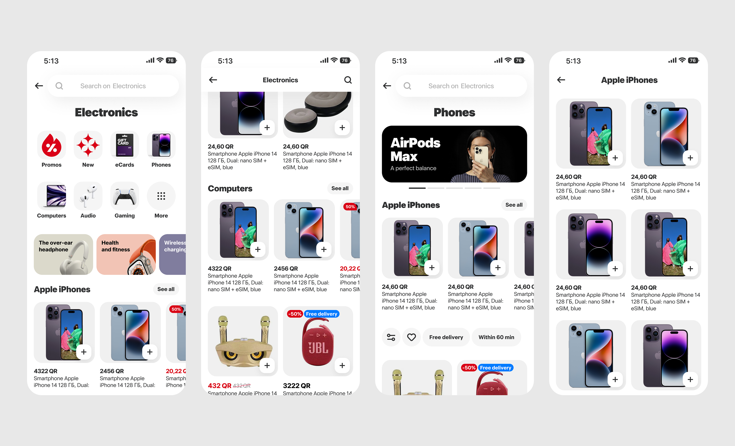
Item listings in marketplace categories
Marketplace Home Page
Once the item-based catalog and dedicated cart were in place, the next step was to define a clear entry point into the marketplace. From both a business and UX perspective, it was important to give the marketplace its own space, separate from the food flow. We also needed a dedicated search experience focused on products rather than merchants.
On the new marketplace homepage, we brought together all the categories that had already been launched. At the top, users see the main marketplace categories with the option to dive into subcategories for more specific browsing. Below that, a personalized product feed appears based on the user’s previous activity, with an option to switch to a popular or promo feed. While we planned to improve personalization over time, this served as the foundation for future iterations.
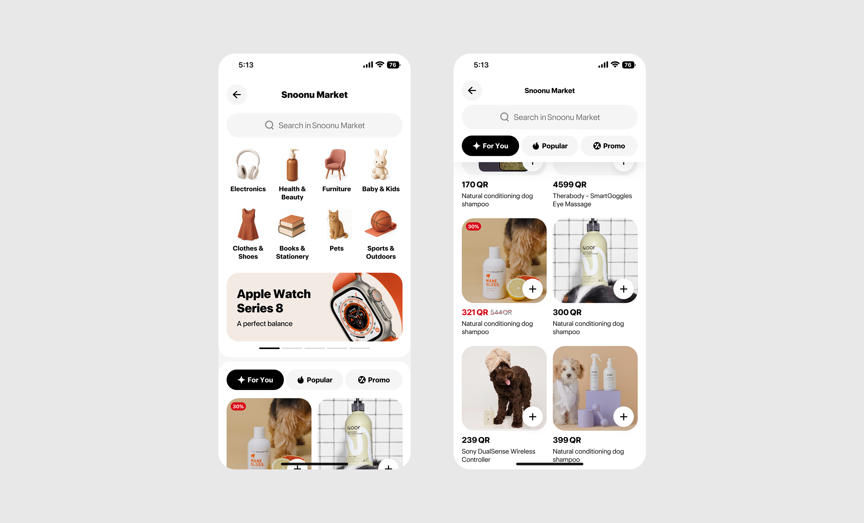
Dedicated homepage with personalized product feed and clear category entry points
Next Case
We conducted different types of product research, including user interviews, a CJM, and a pain and gain analysis
First marketplace concepts
Different approaches for marketplace cart
We explored many directions and eventually concluded that, for business needs and development constraints, the best option was to introduce a new marketplace multi-merchant cart, separate from the food one. This new cart would support multiple merchants and only handle marketplace items.
The next challenge was how to show two carts in the same app without confusing the user. We went with a slider-based solution, where the active cart changes based on the user’s current flow. For example:
- In marketplace categories and search results, the marketplace cart appears first
- In food categories, the food cart is shown first
- Users can always swipe or switch to the other cart if needed
Multi-merchant marketplace cart
We conducted card sorting to design a more intuitive category structure
Once we finalized the categories and subcategories, and the backend architecture was ready, we moved on to the item-based feed within those categories. Now, if a user selected a food category, they would see merchants (as before). But if they selected a marketplace category, they’d see item listings instead.
When users added products from marketplace categories, they would go into the new multi-merchant cart. At first, we were concerned this dual logic might confuse users, so we explored tagging the categories as “marketplace” to make it clearer. But after a few rounds of testing, we learned that the use cases rarely overlapped – it’s not common for people to shop for burgers and smartphones at the same time.
Within each category, we introduced its own set of subcategories and filters. The item-based structure finally unlocked the ability to filter by price, brand, and other useful attributes.
We saw an increase in conversion and average items per order, as users could now explore products from multiple merchants in one go.
Item listings in marketplace categories
Dedicated homepage with personalized product feed and clear category entry points
Next Case